Thin Line Icons for UI Design: Creative Possibilities
What Makes Thin Line Icons a Must-Have for Modern Designers
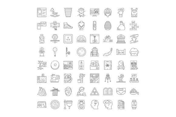
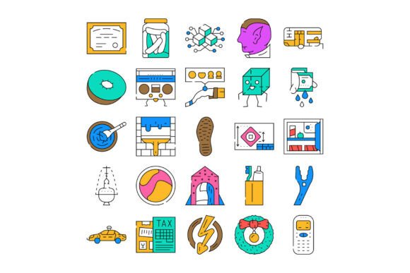
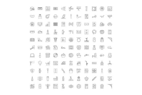
Thin line icons are more than a passing trend—they’re a versatile design solution for modern web and app interfaces. The Collection of Thin Line Icons for User I offers a clean, minimal aesthetic that works across a wide range of industries. Whether you're building a tech dashboard, a travel app, or a lifestyle blog, these icons bring clarity and style without overwhelming the user.
Each icon in the set is crafted with precision, using fine strokes and open space to create a sense of lightness. This makes them ideal for responsive layouts and minimalist UIs where visual hierarchy and readability are key. Unlike bold or filled icons, thin line icons adapt easily to various color schemes and interface styles, giving designers more flexibility in their projects.
How Thin Line Icons Can Elevate Your Design Projects
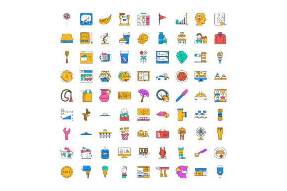
One of the standout features of this icon set is its breadth. It includes symbols covering technology, commerce, lifestyle, communication, travel, health, and media—making it a go-to resource for designers working across multiple platforms and industries.
- Technology – Icons for devices, connectivity, cloud storage, and data visualization
- Commerce – Symbols for shopping, payments, orders, and customer service
- Lifestyle – Visuals for wellness, fitness, food, and home
- Communication – Tools for messaging, social sharing, and notifications
- Travel – Icons for maps, directions, airports, and accommodations
- Health – Graphics for medical, wellness, and fitness tracking
- Media – Symbols for audio, video, photography, and streaming
This variety means you can use the same visual language across an entire platform or app, ensuring consistency while still meeting the unique needs of each section or feature.
Creative Applications Across Different Design Contexts
Designers can take these icons in many directions. Here are a few practical, real-world uses:
- Mobile App Navigation – Use thin line icons in tab bars or menus to keep the interface sleek and intuitive. Pair them with subtle hover effects or color changes to guide user interaction without clutter.
- Dashboard UIs – In admin panels or analytics tools, these icons help break up dense data and make navigation more digestible. For example, a thin line chart icon can represent data visualization, while a calendar icon keeps date-related actions clear.
- E-commerce Platforms – Use commerce icons in product filters, shopping carts, and checkout flows. They help users quickly understand actions like “add to wishlist” or “compare items” without relying on text alone.
- Travel and Lifestyle Blogs – Incorporate travel icons in itineraries or location guides. A minimalist plane icon next to a destination title instantly communicates the theme of the post.
- Health and Wellness Apps – Icons for heart rate, sleep tracking, and nutrition help users navigate health metrics with ease. Their clean lines make them ideal for apps that aim to feel calming and uncluttered.
How to Use Thin Line Icons Effectively
While thin line icons offer a lot of flexibility, they also require thoughtful application to maintain clarity and usability. Here are a few best practices:
- Pair with Bold Typography – Since the icons are delicate, balance them with strong, readable fonts to ensure visual contrast and readability.
- Use Consistent Stroke Weights – If you mix icons from different sets, make sure the stroke widths match. Inconsistent line weights can make your design feel disjointed.
- Consider Accessibility – Thin lines can be hard to see on small screens or for users with visual impairments. Always test your icons in different sizes and contrast levels.
- Add Subtle Animation – A gentle hover effect or transition can help icons stand out without compromising their minimalist charm.
- Group Related Icons – When designing navigation or feature panels, group similar icons together by theme or function to support intuitive browsing.
Who Can Benefit from This Icon Collection
The Collection of Thin Line Icons for User I is especially valuable for a broad range of creators:
- UI/UX Designers – Use them to build clean, modern interfaces that scale well across devices.
- Web Developers – Easily integrate SVG icons into frameworks and codebases for fast, responsive designs.
- Bloggers and Content Creators – Enhance infographics, posts, and landing pages with visual cues that guide readers.
- Entrepreneurs and Startups – Launch a polished, professional product with minimal design overhead.
- Educators and Trainers – Use icons in presentations and course materials to simplify complex concepts.
Because the icons are vector-based, they’re infinitely scalable and editable. You can tweak colors, line weights, and spacing to match your brand identity without losing quality.
Getting the Most from Your Icon Set
To keep your designs cohesive and effective, consider these strategies:
- Create a Visual Language – Define a set of rules for how and when to use icons. This includes size, spacing, color variations, and interaction states.
- Organize Your Assets – Use tools like Figma, Sketch, or Adobe XD to categorize and tag icons for quick access during design sprints.
- Test with Real Users – Run usability tests to ensure your icons are intuitive. If users don’t immediately understand what an icon represents, consider adding a label or choosing a more recognizable symbol.
- Update Thoughtfully – As your product or brand evolves, revisit your icon usage to ensure it still aligns with your goals and audience needs.
Final Thoughts: Why Thin Line Icons Matter
In today’s design landscape, clarity and simplicity are more important than ever. The Collection of Thin Line Icons for User I offers a smart, scalable solution for anyone building digital experiences. Whether you're designing a startup’s first app or revamping a personal blog, these icons help you communicate ideas with elegance and precision.
By combining visual appeal with practical functionality, thin line icons empower designers to create interfaces that are both beautiful and user-friendly. And with a broad range of symbols covering essential categories, this collection is a versatile tool for any creative professional looking to streamline their design process and elevate their work.